The magic portal would typically materialise on the bus. Too imposing to fit in a schoolbag, it would arrive under a careful arm: some gatefold conundrum by Pink Floyd, Led Zeppelin or someone stranger. This is how music announced itself in the 1970s. A heavy, 12-inch-square head-trip foreshadowing unknown pleasures.
“The poor man’s art collection,” is how Noel Gallagher describes the tactile wonders of the vinyl era in Squaring the Circle (The Story of Hipgnosis). It was later LP sleeves by the Smiths and the Jam he recalls turning his own bus trips to reveries. But you’ll find little debate from him or anyone else about who defined the “golden age” of album art.

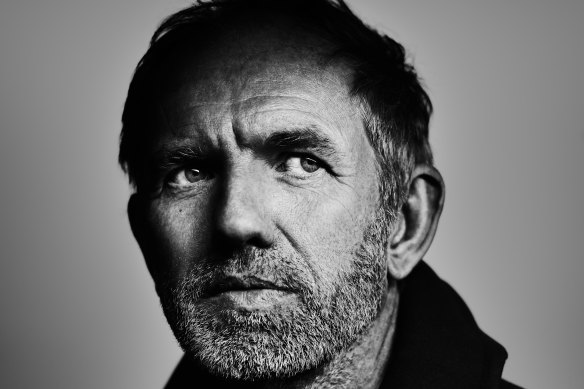
Filmmaker Anton CorbijnCredit: Stefan Vanfleteren
“The importance of Hipgnosis is obvious,” states Anton Corbijn, Zooming in from a remote corner of Ibiza. The Dutch photographer and filmmaker (Control, The American) made the documentary about the seminal London design duo premiering at MIFF next week as a pandemic project.
“It’s not that I like all the stuff they do, but some of the stuff they’ve done I absolutely love and admire and [it was] very significant for me when I grew up,” he says. “On a technical level they were amazing. The way they connected visuals to music … on something like Houses of the Holy or Wish You Were Here, I mean, these are pretty amazing sleeves.”
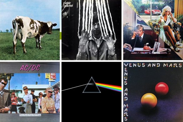
A prolific album artist himself (U2, Depeche Mode, Nick Cave, Bon Jovi, Killers …), Corbijn’s favourite Hipgnosis creations tend towards the purely photographic: the comical rearview of a spotted cow on Floyd’s Atom Heart Mother; early Peter Gabriel albums with their scratched and melted black-and-white portraits.

Some of the most iconic album cover designs from the Hipgnosis designers.Credit:
The world is better acquainted, to say the least, with the light prism on The Dark Side of the Moon and the spot-lit fugitives on Band on the Run. From there to Zeppelin, T.Rex, 10CC, ELO and hundreds of others, the surreal cover designs of Storm Thorgerson and Aubrey “Po” Powell are among rock’s most iconic.
The pair were named Hipgnosis, according to Po’s disputed recollection in the film, by Floyd founder Syd Barrett, history’s most famous LSD casualty. It was the bond of friendship and trust between the musicians and visual artists, all radical outsiders in the pre-corporate music biz of the ’60s, that allowed Hipgnosis to blossom.
“They became a part of us,” Zeppelin’s Robert Plant tells Corbijn in the film. Jimmy Page, Paul McCartney, Peter Gabriel and the three surviving Floyd members are other big guns paying tribute. “Not easy to get,” the director notes with a laugh.
“I think the love that they have for Hipgnosis … overrode any kind of hesitations. Also, they’re all older; all towards 80, most of these people. So I guess it was like now or never … If you want to say something about the work and the people you loved working with, now’s the moment.”

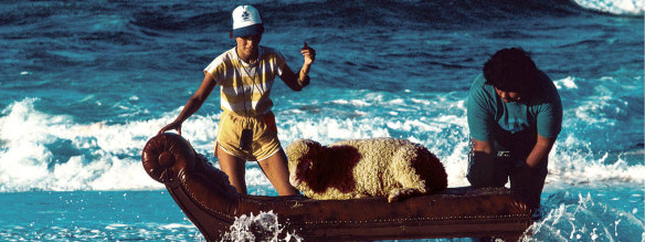
A scene from Squaring the Circle, shot for a poster insert for 10cc’s 1980 album Look Here.Credit:
The statement underscores the elegiac tone of the film. With Po as wistful guide, Corbijn opts for a black-and-white palette with only the album covers blazing in colour. It’s a crafty invocation of the Hipgnosis effect: the trippy portal suddenly illuminating the grey school bus.
The look also emphasises distance from an era that was already declining when Corbijn left Holland to work for the New Musical Express in new-wave London. Then, Peter Saville was the coming name in album design. His sleeves for Joy Division, OMD and New Order led him well into the Britpop ’90s. “A lens of fascinating excess” is how he describes Hipgnosis from his more austere modernist perspective.
Saville is one of several successors and contemporaries who turn up in the film, but again it’s Noel Gallagher who defines the sense of an age irretrievably lost. “People believed music was art, and it could change the world,” he says. “Now music is a commodity and it changes the share price of whatever company it’s attached to.”
Sydney album designer Aaron Hayward knows what he means. His work for Australian major labels is increasingly “designed by committee” and overnight success imperatives: money-first principles unlikely to unearth the next Pink Floyd.

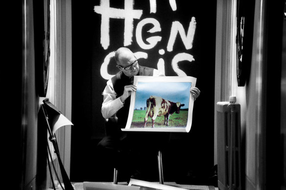
Hipgnosis’ Aubrey Powell with the artwork for Pink Floyd’s 1970 album Atom Heart Mother.Credit:
There was no vinyl on the school bus when he grew up squinting at CD covers by the Mars Volta and Audioslave. But as it happened, they were among the later works of Thorgerson (a maddening contrarian by all reports, he fell out with Po in 1983). Hayward soon made the connection with his parents’ trippy old record sleeves, which he’d obsessed over as a kid.
When he and David Homer opened their own design studio, Debaser, in 2003 “that was kind of our inspiration, all that Hipgnosis stuff with Storm. We found this old book in a secondhand store about their studio. It used to sit on our desk all the time.
“We always went into projects with that same idea they did. It’s high-concept. You have to have an idea – something that you take from the music or take from the lyrics. You need to tell a story.”
Debaser won best cover art for Bernard Fanning’s Tea & Sympathy at the 2006 ARIA awards. They would win several more in later years from a total of 13 nominations: Kasey Chambers, Birds of Tokyo, Empire of the Sun, 360 …

Some of Sydney album designer Aaron Hayward’s local album covers.Credit:
Hayward’s new studio, Next Episode, “does about 50/50 music and corporate work whereas Debaser was 80 to 90 per cent music”, he says. “We had the ability to experiment a bit more back then. Now it’s a lot more reactionary. You don’t get the time sometimes to spend on projects.”
The good news is that Thelma Plum, Tash Sultana, Powderfinger and Cold Chisel all have vinyl on the Next Episode drawing board. “With Debaser it was all CD and then iTunes [thumbnails] … Now the first thing any project asks for is the vinyl design because that’s got a huge production lead time. That’s quite nice. You get to see the work nice and big.”
Anton Corbijn is also doing a lot less album photography these days. “Vinyl is making a comeback, but of course not to the extent that [it] was in the ’70s and early ’80s,” he says. “And the significance of album sleeves, that’s gone. Before you had all the online information, all the information you had was on the sleeve. That kind of importance is no longer.”
Corbijn doesn’t come across as a sentimental man. He’s looking forward to his next film, an adaptation of Australian playwright Joanna Murray-Smith’s Switzerland: a fictionalised account of the last days of crime writer Patricia Highsmith to be played by Helen Mirren. But ask him if he misses the golden years of album art and he’s a kid again.
“I love album sleeves. I love the gatefolds. It’s wonderful – all the things you could do. Fortunately, with Depeche Mode, we still do gatefolds.
“I think quite often we exchange quality for comfort in our lives,” he says. “I think it would be very sad if everything gets reduced to this.” He holds his thumb and forefinger close together and moves them closer to the Zoom screen. But there’s nothing there.
Squaring the Circle (The Story of Hipgnosis) is at ACMI as part of MIFF on August 15. miff.com.au